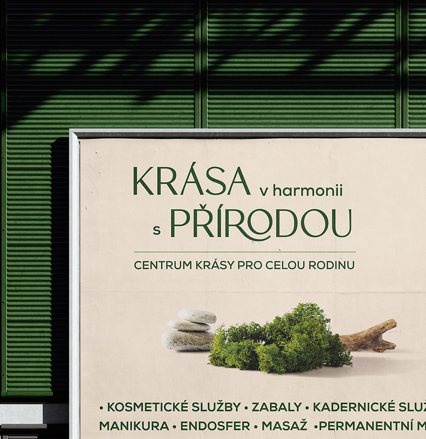
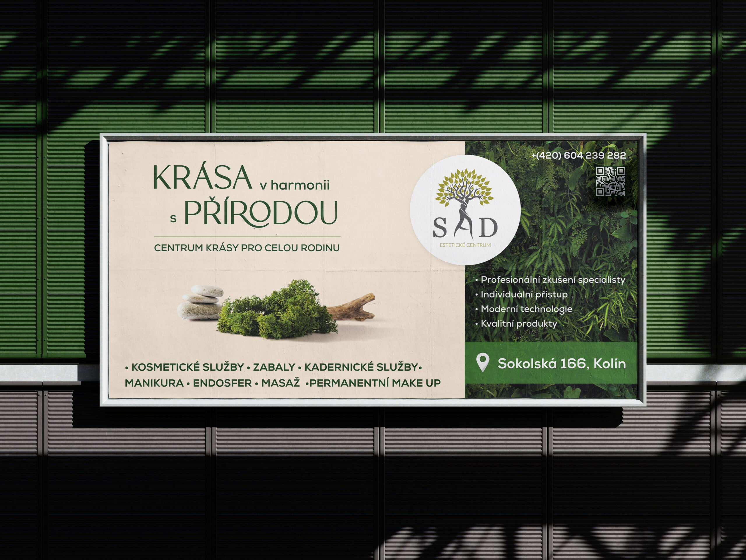
For the outdoor advertising of the SAD beauty center, a layout was needed that simultaneously conveys the brand’s character and is quickly readable in an urban environment. The visual concept is built on a combination of natural textures, a soft light palette and calm, elegant typography. The main emphasis is on a strong headline, a natural association with harmony and beauty, and a compact presentation of key services and contact information.
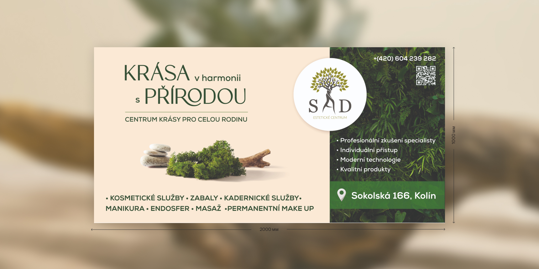
The visual idea is based on the theme of harmony with nature. That’s why the layout uses a calm cream base, green accents, organic photographic elements and a natural association through moss, stone and leaf texture. The layout is built on the principle of quick readability. Attention is first drawn to the main slogan, then to the center’s positioning, after which the viewer moves to the list of services and the contact block with the address and phone number.