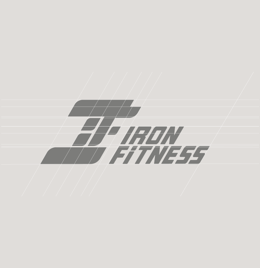
Iron Fitness is a brand identity built around strength, movement and athletic energy. The logo has a compact geometric form that can be used as a standalone mark or together with the brand name. The combination of graphite gray with bright orange creates high contrast and supports the brand’s active, modern character.
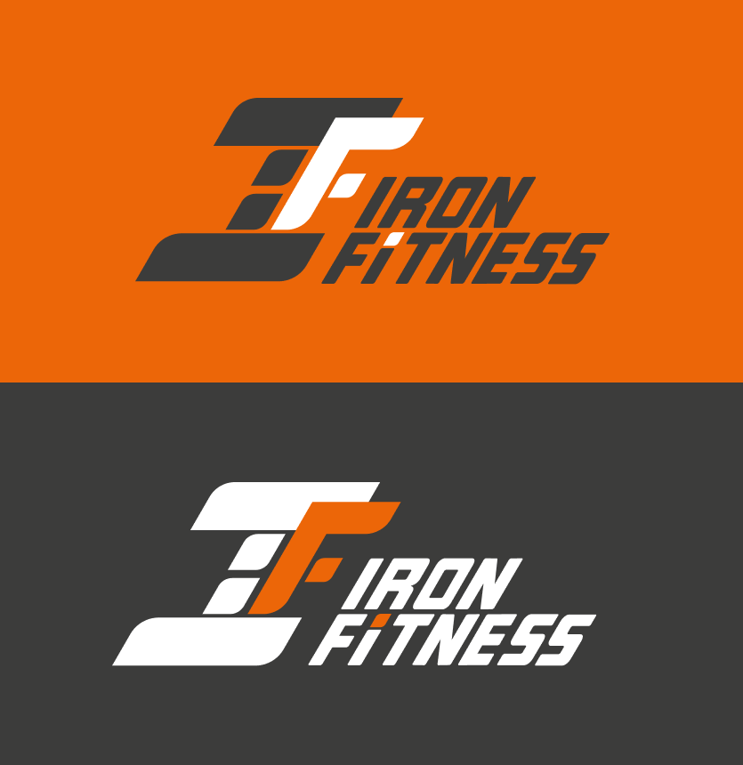
At the core of the mark are stylized I/F initials combined into a single compact geometric shape. Slanted lines and sharp geometry create a sense of movement, speed and physical strength. The identity is built on high contrast and a limited palette. Graphite forms a strong base, white ensures clarity and readability, and orange works as an energetic accent.