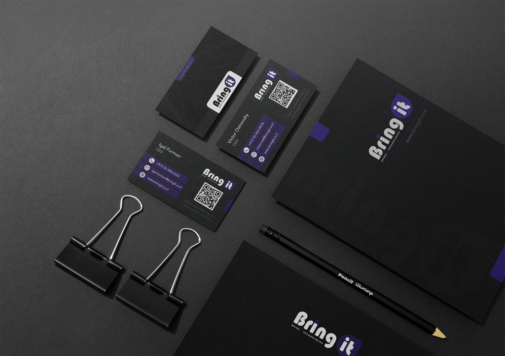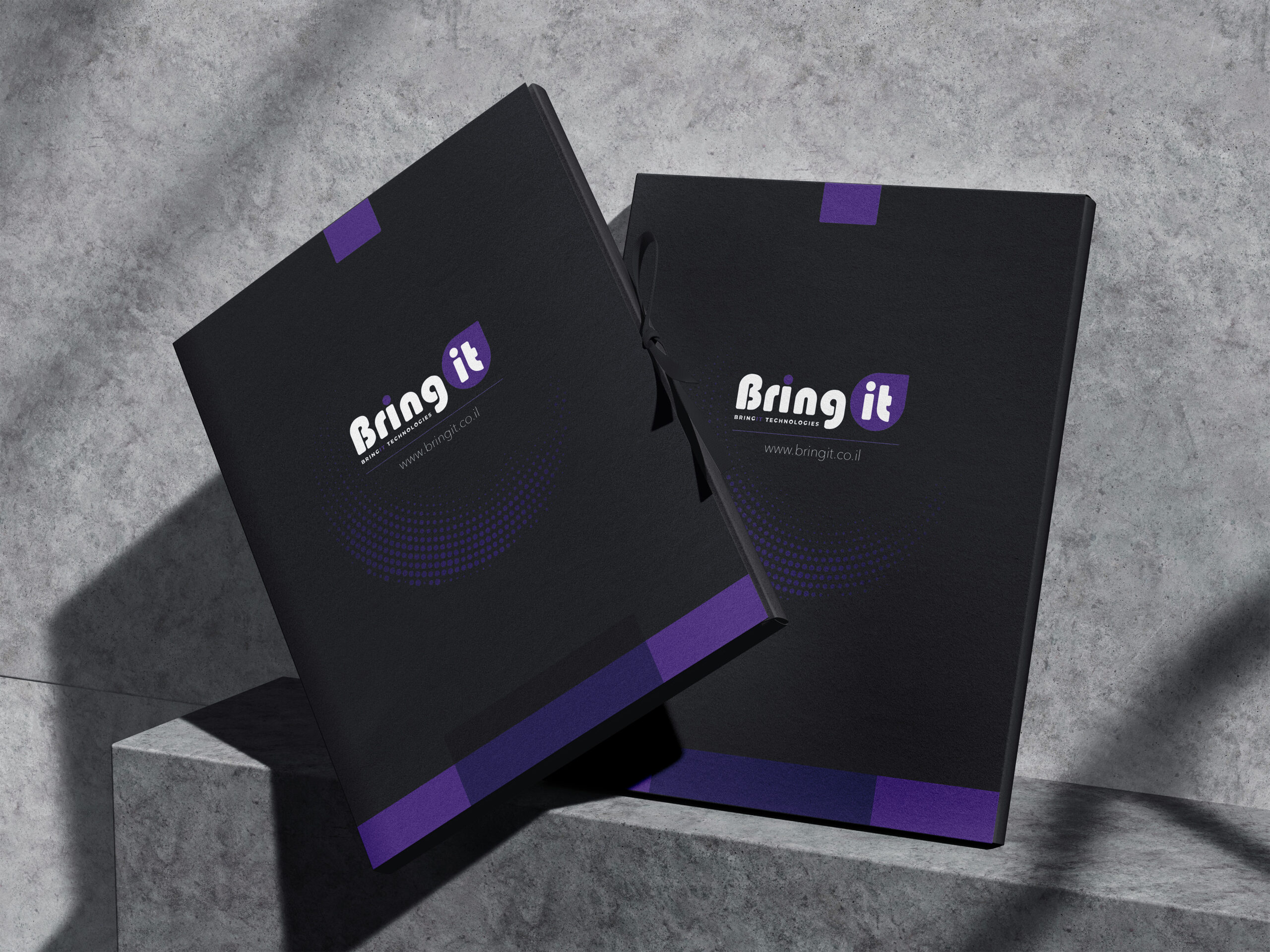
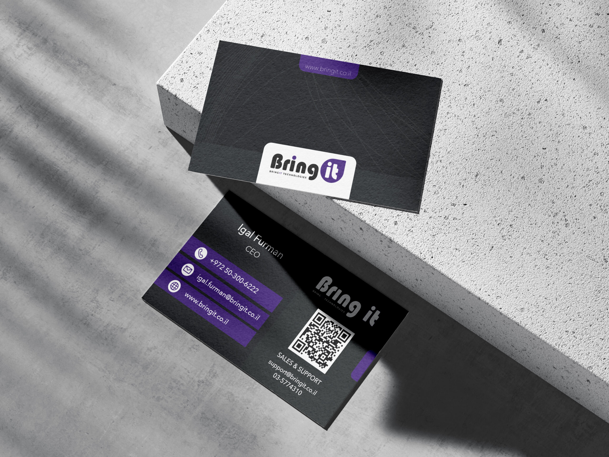
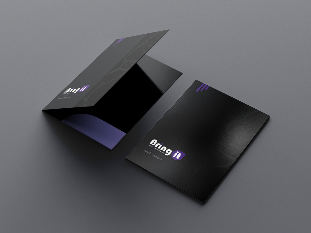
The Bring IT visual system is built on the contrast of deep black, white and a bright violet accent. This palette supports the brand’s technological character and creates a distinctive corporate image. A unified graphic logic was developed for different media: large dark planes, spot color accents, thin abstract lines and a clear information structure.
Task
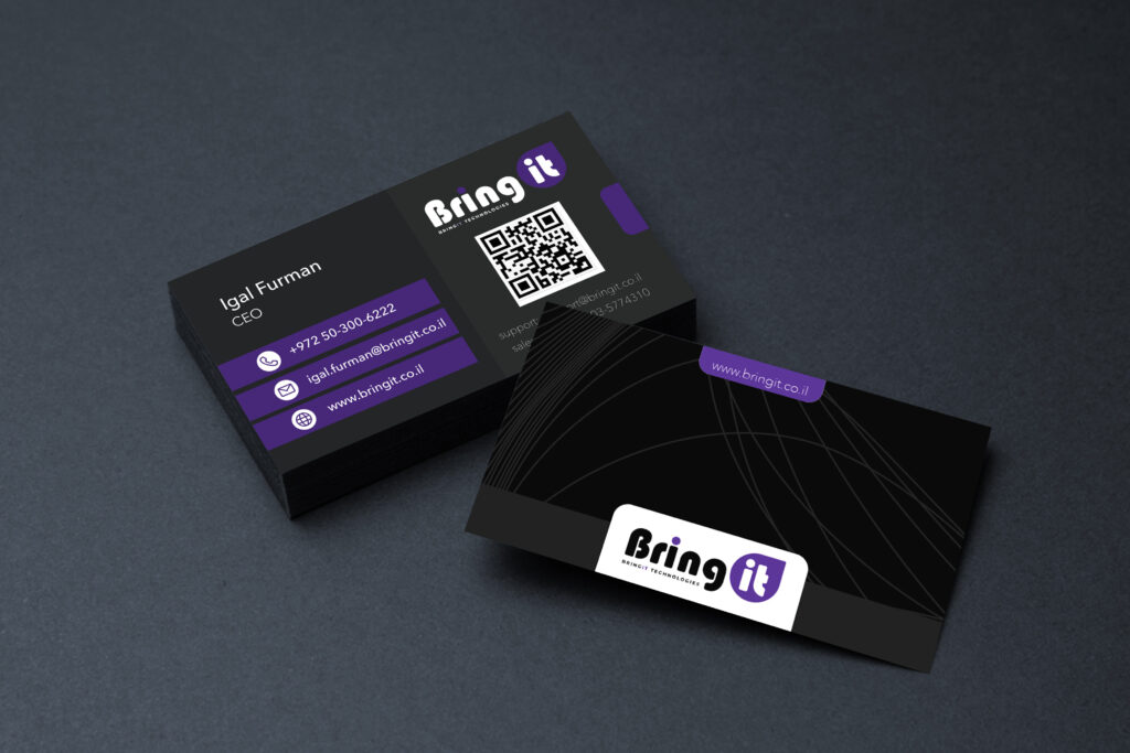
The main task was to carry the brand’s technological character over to practical corporate media and maintain a unified visual language regardless of format. Special attention was paid to information hierarchy: contact details had to be easily readable, the QR code had to remain functional, and the brand had to dominate the composition without overloading the design.