
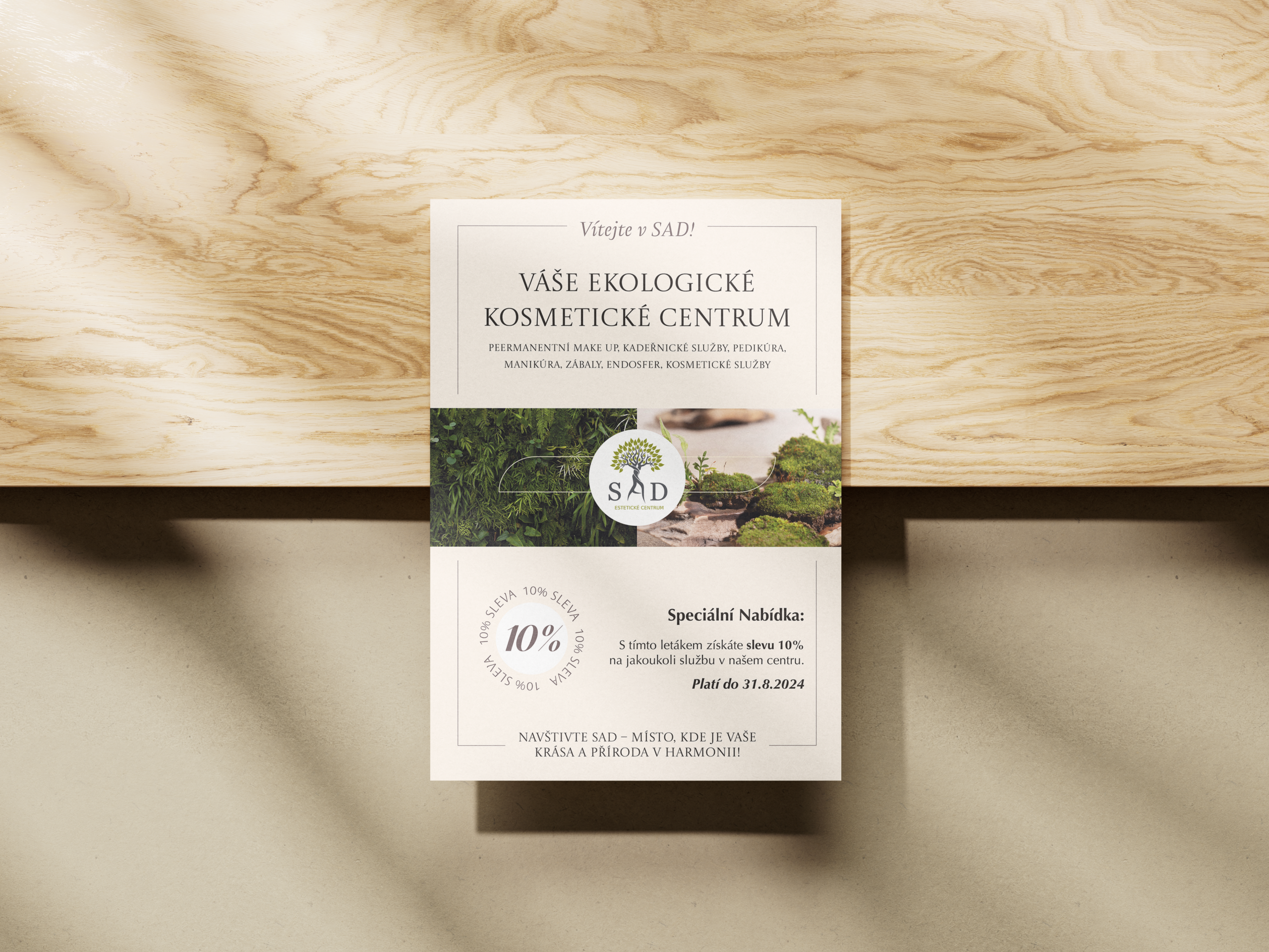
SAD is a beauty center that combines beauty services with an emphasis on naturalness, comfort and a gentle approach. For the advertising flyer, a calm and elegant visual style was needed that matched the brand’s character while staying noticeable enough in print communication. The visual concept is built on a light neutral palette, natural photography, thin lines and classic typography. This conveyed a feeling of cleanliness, care and naturalness without excessive decoration.
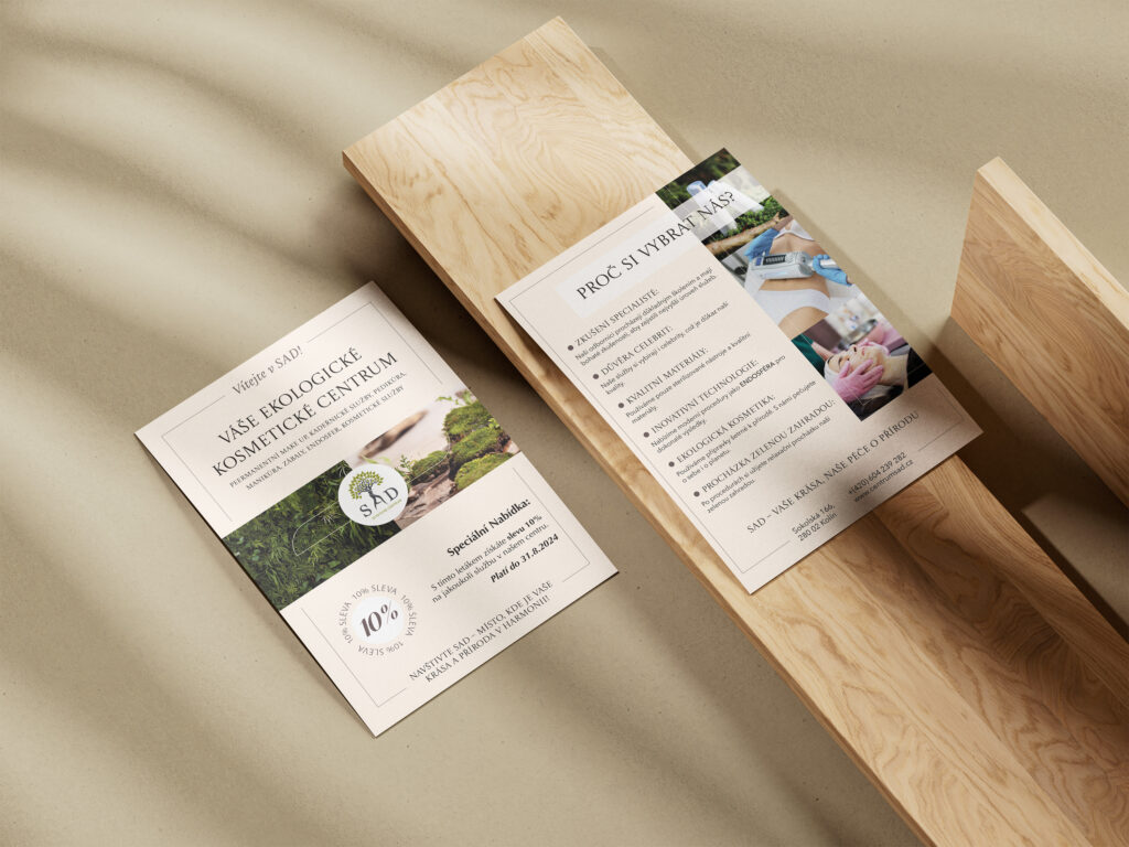
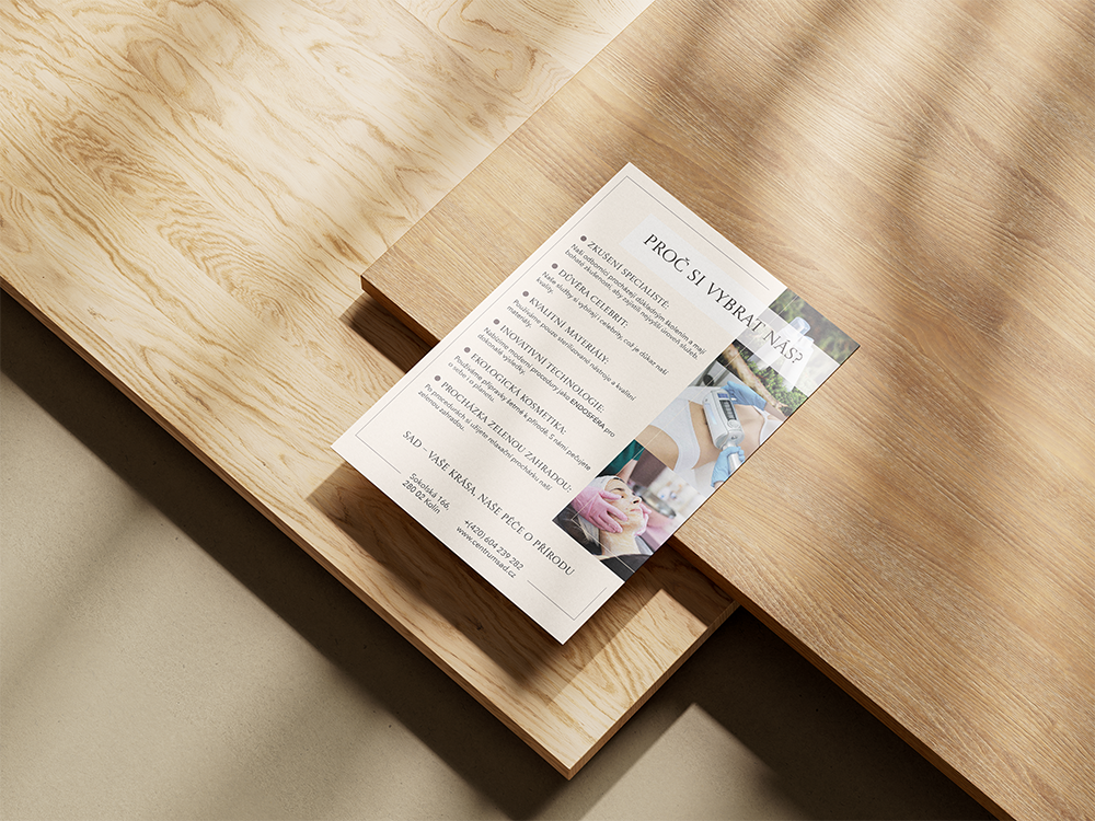
The foundation of the design is the idea of harmony between beauty and nature. That’s why, instead of a bright cosmetics ad, a soft neutral palette, natural textures and minimalist composition were chosen.